Devlog Week 13


Liam - Programming
UI Upgrades
One of the main bits of feedback given about the UI was that it was unclear which connection was which, along with not realising that the number keys could be pressed to switch between connections.
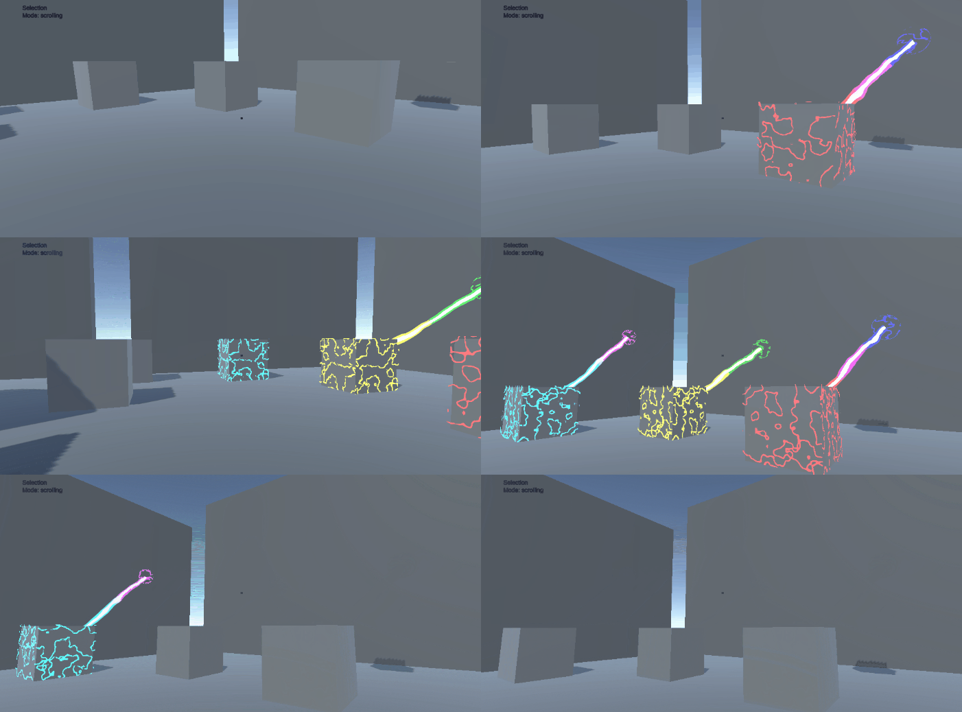
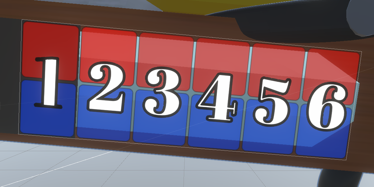
Adam added some extra colours to distinguish the connections from each other, and I updated my UI elements to pull those colours and update the UI panels to match.

Next I added some numbers to each UI group so they know which key to press to select that group. I used an open-source font called Abril Fatface, partly because it sounded funny, but also because it had a nice, old typeset look to it. I made it a clear white with enough of a solid black border so they don't blend in with the rest of the UI.
Smooth Reset
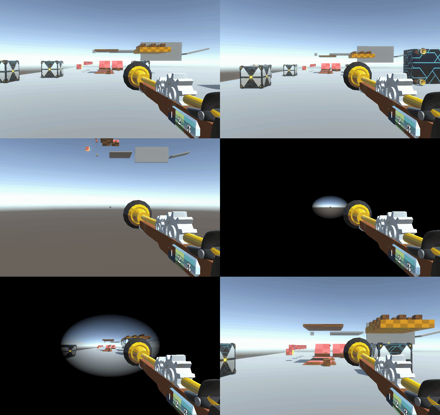
Next was a bit of visual flare to smooth out the level transition and player death experience instead of the instantaneous loading of new levels and resetting of the player. I decided the easiest way to do this was a simple fade-in/out with a vignette effect. Unfortunately (fortunately?) the default vignette effect available can't fully fill in the screen, but I found that adding a lens distortion effect could be used to distort the effect to fill the entire screen.
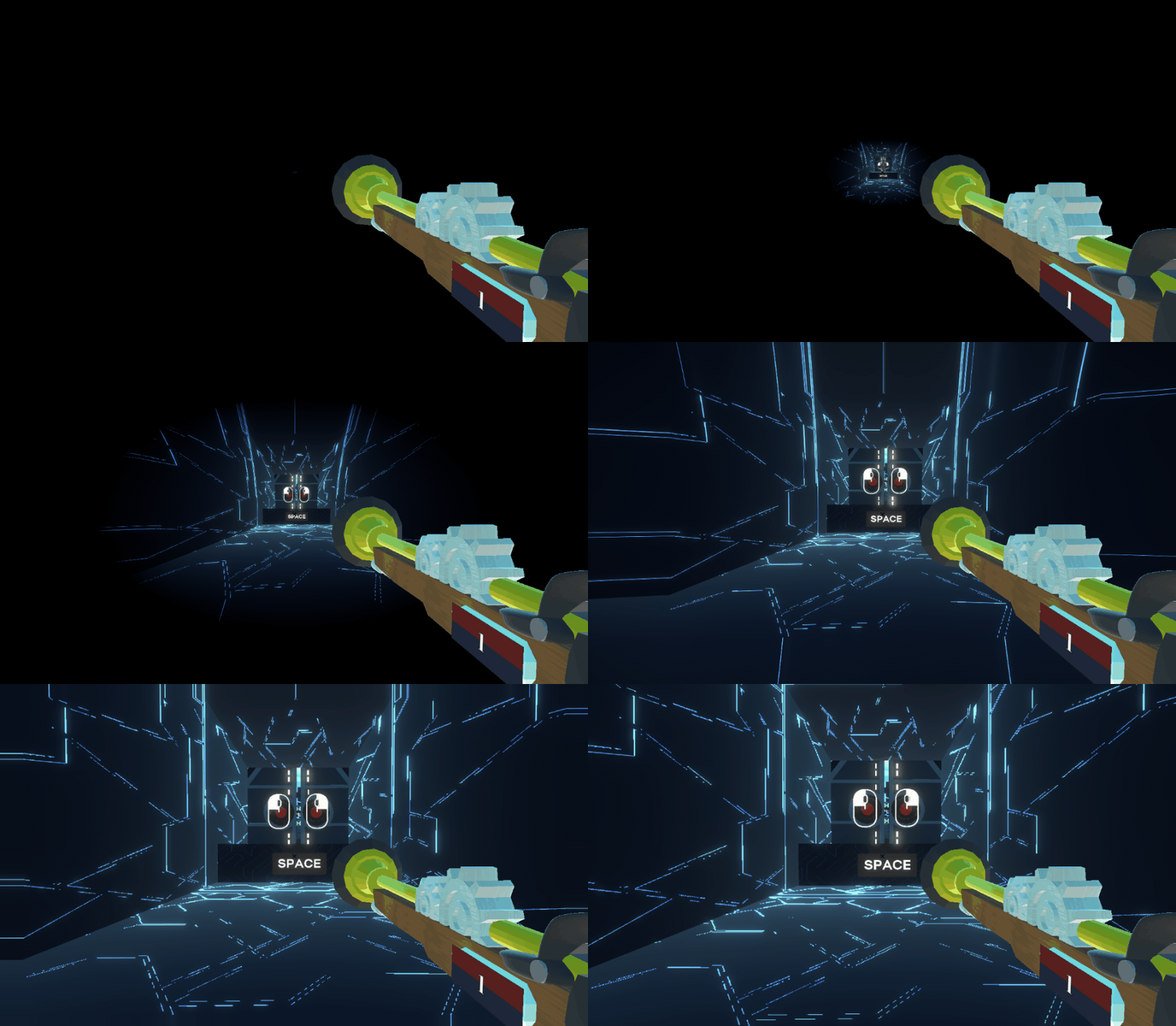
The blunderbuss isn't affected due to it being rendered by an overlay camera that is ignoring these post-processing effects. I found that when I did apply these effects, the blunderbuss visually stretched in a rather messy fashion around the edges, and I rather prefer the current look the makes it feel like the player is "sliding" into the world.
Next I added the reverse of the effect upon the player falling out the level, adding to a nice smooth effect.
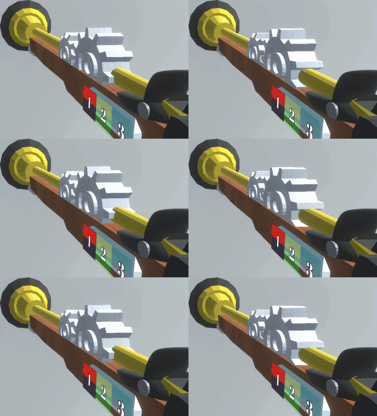
Another request out of testing was for an alternative to the scroll-wheel input. We settled on Q/E, and Adam implemented those keys affect the connections, while I implemented them affecting the gears on the gun.
Adam - Programming
After the testing session there were various issues that were found, though the game was pretty stable for the most part. One issue was that the moving platforms would through the player off while they were standing on them rather that just have the player move along with them. I thought this might have been some sort of issue with the scaling but it turned out to be that there where two triggers on the platform instead of one. The way the relative momentum works is that the platform pushes the player by whatever its velocity is. With two triggers it was doing it twice and moving the player too far. This was an easy fix as Ethan simply needed to adjust any platforms with two triggers to only have one.
The next major issue was that the players were having trouble distinguishing between the separate connections. This was because each connection effects was red and blue so they all looked the same. The easiest fix for this was to add different coloured pairs for the effects. As our current max amount of connections is three I created two new coloured pairs: yellow and green, cyan and magenta. This should make it much easier to remember which connection is which. The GUI on the gun had to be updated to match this as well.

Different Effects
I also made change to the scrolling controls so that there was an alternative way to move objects. I had a discussion with one of the testers and they pointed out that scrolling with a mouse may be easier for some people and harder for others. I decided to make Q and E also perform the scroll action so that players can choose whichever mode is comfortable.
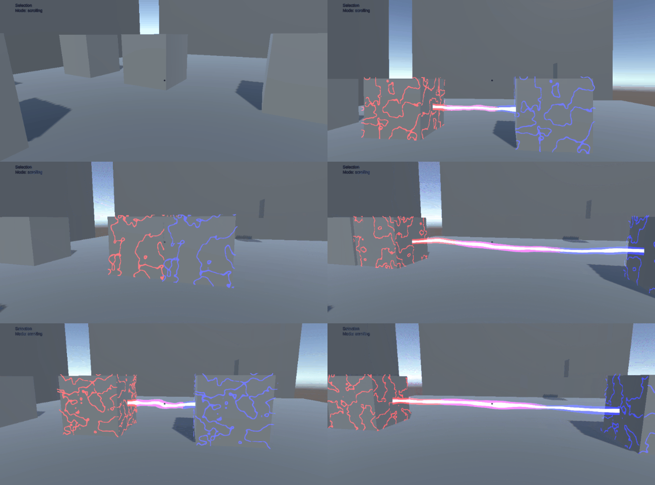
Scrolling with Q and E (trust me)
As we move towards submission I will be fixing bugs as they arise. Outside of that my main focus is adding sounds to the game to give it more polish.
Ethan - Level Design
This week I worked to fix general bugs and address comments that we received in our testing session related to the level design. In the previous week we received feedback that level 3 was a large jump in difficulty and too long compared to its predecessors, so I separated it into two separate levels to solve this. I decided to reduce level 3 by removing the rotating platforms and introducing them as a new element for level 4 instead. I also reduced the amount of backtracking required to collect enough batteries to progress. In the original, the player was required to transport batteries all the way from one end of the level to the other. Now they will only need to transport one battery from the second large platform to the third, which should be much more manageable and less confusing. The total number of batteries in the scene and the power requirements to progress have been reduced accordingly.
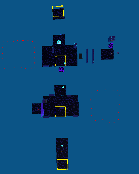
New Level 3 layout (removed puzzle areas marked in red)
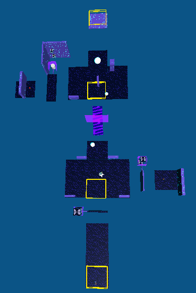
Level 4 Layout
The new fourth level contains the rotating platform puzzles that were cut from level three as well as a few new ones to emphasise this new level theme. Additionally, we also hope to implement our enemy model, the Dreadfulnaught, in the level in some capacity, if we are able to overcome the technical difficulties with playing its walking animation.
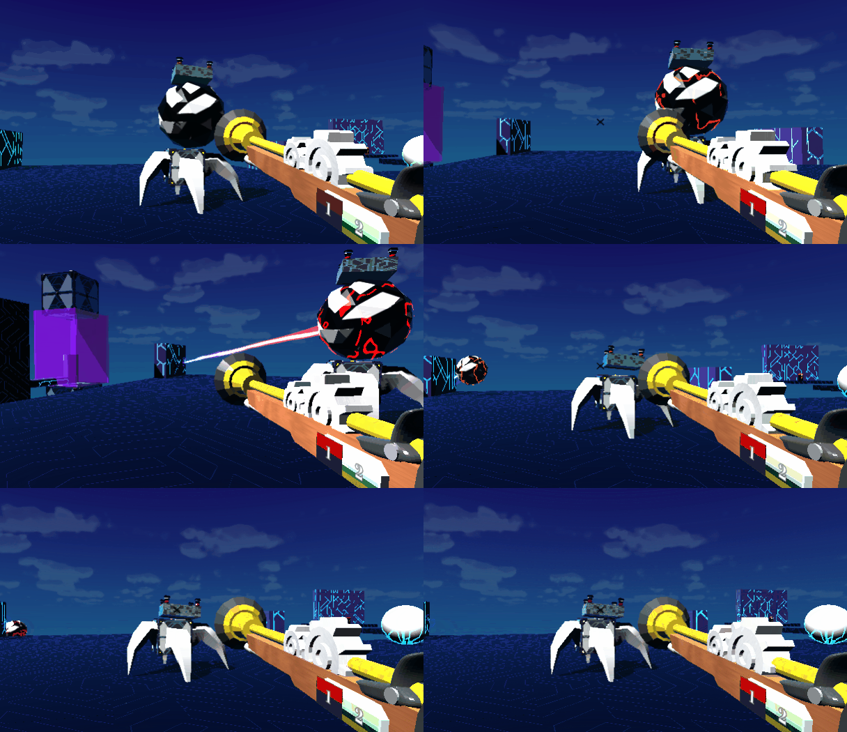
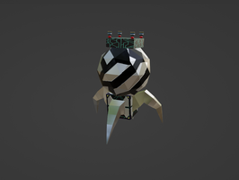
Example of the player interacting with our currently static Dreadfulnaught
I also improved the UI in level 2 to help address the concern of multiple connections being confusing for testers. I added a pointer icon by goff.brian above number key icons by Gamedev Lab to indicate that the number keys should be pressed, and coloured them to match the UI on the gun and the special effects of the different connections. We hope that collectively these changes will make the connections easier to understand.
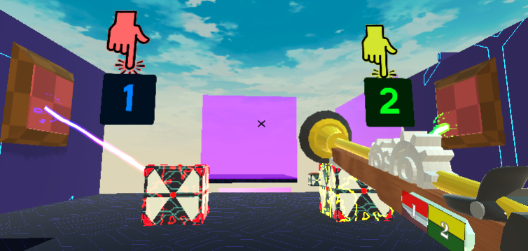
Improved connection UI including different coloured special effects, in-scene UI prompts and a numbered gun interface
Aiden - Modelling
Dreadfulnaut
The one and only enemy in the game up to this point. Dreadfulnaut has long last arrived! In the beginning, it was designed to have four wheels functioning as feet, but the final product did not have an unsettling enough appearance to cause the player to jump. As a result, I've given it four legs like those of a crawling spider and allowed it to creep slowly towards the player. Regarding the overall concept, it is comprised of a number of different objects with which the player has interacted during the course of the game. The player could start to feel uneasy as a result of this, since it can lead them to believe that the whole world is conspiring against them.

In addition to the crawling motion, I produced some random shaky animation for the body in order to give the impression that it is a living thing contained inside a robotic body. Along with the model, the dreadfulnaut's sound effect has also been updated with this version.
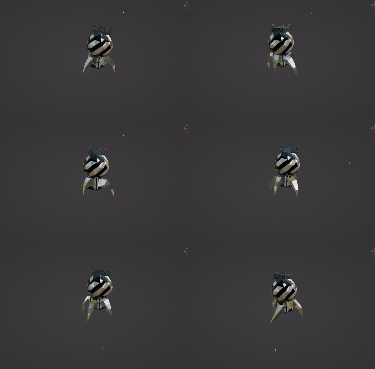
When the FBX file was loaded into Unity, there were certain problems that caused the animation sheets to be missing. However, I was able to get around this problem by importing the whole blender file into Unity rather of rendering it as a fbx file. This worked well. If this information will assist other people who read this DevLog get an idea of how to address the same issue when they run into it in the future project, then I will consider this post a success.
This is most likely going to be the last DevLog that we put up, but it could not be. Who could say? But in any case, we want to thank you for being engaged with our project and wish you all have fun with our game :)
Connector Gun
Connect objects to traverse a mysterious world of puzzles in as many ways as you can imagine!
| Status | In development |
| Authors | estainer, utas-llf, lhadinh, Losmada |
| Genre | Puzzle, Platformer |
| Tags | First-Person, Puzzle-Platformer |
| Languages | English |
More posts
- Devlog Week 12Oct 13, 2022
- Game Testing SummaryOct 06, 2022
- Devlog Week 11Oct 06, 2022
- Devlog Week 10Sep 27, 2022
- Devlog Week 9Sep 20, 2022
- Devlog Week 8Sep 06, 2022
Leave a comment
Log in with itch.io to leave a comment.