Polish and UI
This week's focus was on adding UI elements, menus, and implementing additional features that I had been working on for a while.
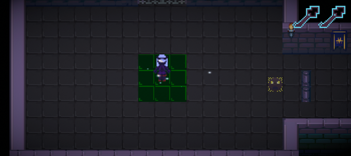
Icons indicating the keys in your possession now appear, in the top right corner of the screen
This game currently doesn't use a health or score system, but it does use keys, so I made a sprite to represent them in the UI. Because the player will hold two keys at most at any given time, I decided to represent the keys using individual key icons that disappear when each key is used. I felt this would show the key being used more clearly than having a key icon constantly on the screen and using a number to represent the count. The keys were originally a solid purple with only a little bit of blue, but after adding the sprite to the game I realised that it was quite difficult to see it, so I added a bright blue outline to make it much more noticeable.
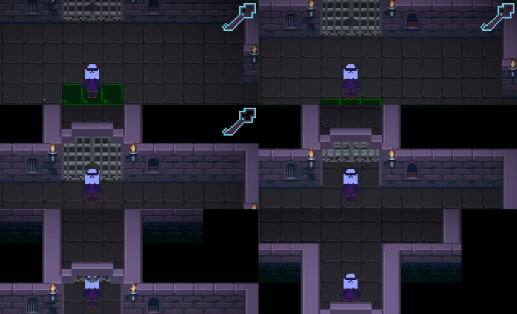
Collect keys and use them to open gates
When you are near a gate, you can press Space to use a key and open it. However, I'm thinking about making this automatic once you get close enough to a gate, as the additional keypress makes the process take a little longer and allows time for the deadly tiles to catch right up to you, which is tense, but also a bit frustrating.
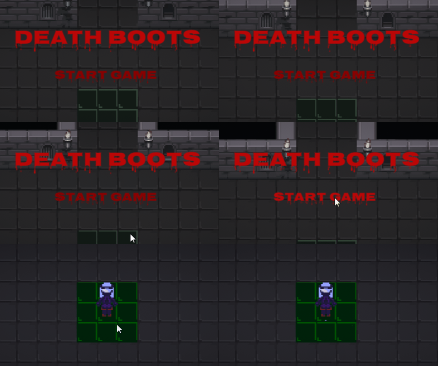
The game now has a title screen.
The game starts from a separate main menu now instead of from the original scene with the player. I used the SceneSwitcher code from the KIT109 Tutorial 4 to move between the scenes when the start game button is pressed. The main menu's background moves through the level, giving players a glimpse at what will be ahead.
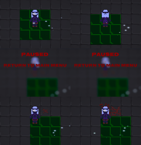
You can now press P to pause the game. This also brings up a button to return to the title screen
I added a pause key (P) which sets the flow of time to zero, stopping everything in the game. I used Unity's "timeScale" for this, which I remember my tutor Lindsay casually mentioning at some point. The pause menu has a button that allows you to return to the main menu. I also added a blur effect to the screen, both to make the text stand out and emphasise the pause, and also to prevent players from exploiting the pause button to make the game easier by stopping and planning their path in advance rather than thinking on the spot. I used my knowledge from Tutorial 4 and 14 of Games Fundamentals to implement these features.

The blue tiles add a new puzzle element to the gameplay
I also implemented the "blue tiles" which I had been working on for a while. Throughout the dungeon, there are rooms full of these tiles, and the objective is to step on all of the blue tiles in a room to receive a key. This forces players to consider their movement even more carefully than before and allows scope to create some genuinely challenging puzzles (even as the creator of the game, the room in the GIF above took me a while to work out how to complete). Unfortunately the mechanic to give the player a key after the room is cleared was not working in the latest build, but I will continue to investigate this. Fixing it before the final submission is one of highest priorities as it is a significant bug. It was also surprisingly difficult to make the blue tiles fade away when the player stepped on them. My plan was to adjust their transparency to achieve this effect, however it seems Unity locks colour changes to tiles by default, which initially stopped this from working. Credit to MesserFechter (2018) for their comment which revealed how to fix this.
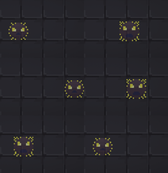
The electric enemy now has a proper sprite and animation.
I made a couple of sprites for the electric enemy, deciding to keep the circular shape and transparency that the placeholder had for the new design. They're not a dangerous enemy, but they can cause the deadly tiles to catch up easily by shocking you and slowing you down. They also seem to be ranting angrily about something, but I don't know what - maybe one day I'll think of some secret lore to explain why they are like this.
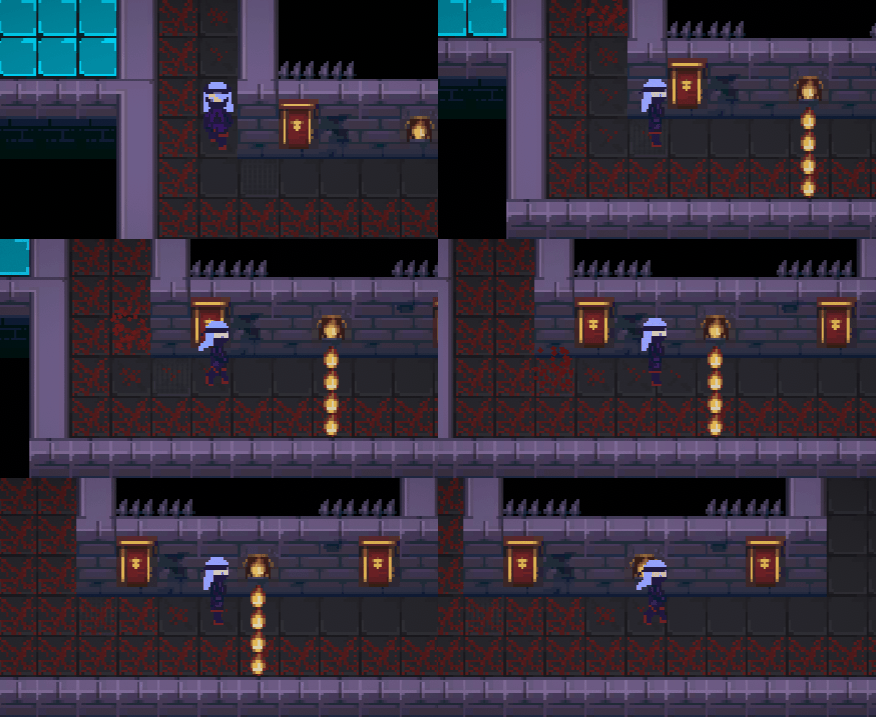
Stepping on the secret switch will activate the flame bar
I also added a trap for a bit more gameplay variety. When you backtrack along this tunnel, a fire trap will suddenly activate, testing the player's reflexes. Touching the flames will destroy you just like the deadly tiles, so the player gets put in a difficult position where they need to wait for the obstacle to be removed whilst also moving quickly enough to stay off the approaching deadly tiles. It's intended to surprise the player, but I also want the player to be able to quickly react to the fire in time to save themselves, so I may need to adjust the timing window or add an effect to sharply draw attention to the trap if I find players are struggling to respond in time.
Feedback
Perhaps an indicator of which path your character is going to take upon queueing up some moves would help people with the controls
A few people felt the game didn't provide enough visual feedback to show how the input queue system worked - to them it seemed that the player was moving on its own against their will. Because so many people have been divided on the input I have been thinking about separating the game into two modes: one that is fast-paced with the rapidly changing deadly tiles, and one akin to the original Sootopolis puzzle inspiration where you can safely stand still on a tile as long as you haven't stepped on it before. Both of these modes would use the "hold key down" input style, but I think the latter mode could still benefit from a form of UI that allows players to visually plot out a path on the screen, either with the mouse or the arrow keys.
The font used didn't quite match the rest of the game aesthetically.
I picked the font Nosifer by Typomondo (2021) because of the horror-esque dripping effect that I felt could fit with the general sinister theme of the game. However I agree that the font may seem a bit odd because the rest of the game uses 16-bit art, while the text has a much higher pixel resolution. I will have another look and see if I can find a font that is more pixelated.
References
MesserFechter (2018), Color of a tile - Tilemaps Unity 2017.2 - Unity Forum. Unity Forum, https://forum.unity.com/threads/color-of-a-tile-tilemaps-unity-2017-2.496469/#po...
Typomondo (2021), Nosifer. Google Fonts, https://fonts.google.com/specimen/Nosifer#standard-styles
Death Boots
Fast-paced tile puzzle game made for main assignment of Games Fundamentals at UTAS.
| Status | In development |
| Author | estainer |
| Genre | Puzzle |
More posts
- Documentation + User GuideOct 17, 2021
- Game TestingOct 07, 2021
- Presentation & GraphicsOct 03, 2021
- Enemies, Interaction, PuzzlesSep 27, 2021
- Level BlockingSep 19, 2021
- Player MovementSep 12, 2021
- Game ConceptAug 29, 2021
Leave a comment
Log in with itch.io to leave a comment.